How Thunderforest Creates Maps
In this article, company founder Andy Allan explains what’s involved in creating maps, what the challenges are, and how often maps need updating.
- What inspires you to create new maps?
- Why does Thunderforest use OpenStreetMap?
- How do you decide what detail to add?
- What are the main challenges when creating a map?
- What qualities do you need to be able to create a map?
- How do you know when a map is ready to be used?
- What’s involved in maintaining a map?
- What do you enjoy most about creating a map?
What inspires you to create new maps?
The first step in creating a new map is to have a strong reason for it, like a particular feature to show or a type of activity in mind. Then if that doesn’t fit into one of our existing maps, we create a new one.
Our newest style, Atlas, was based on lots of customer feedback, and shaped by many of the custom map styles that we were creating for customers.

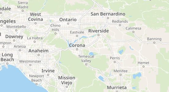
The Atlas style is a clear map style for both navigation and local context, optimised for urban, mobile exploration.
Why does Thunderforest use OpenStreetMap?
We use OpenStreetMap for almost all of our map data. The big advantage of using OpenStreetMap, over any other data source, is that it contains so much detail about so many different types of things, often not normally available.
So if I want to show ski routes, it has the data. It has the difficulty level, the type of grooming, nordic vs alpine skiing, and so on. It usually has even more information than is possible to show, even on a specialist map.
Read more about why we use OpenStreetMap.
How do you decide what detail to add?
I usually consider three factors:
- What I would like to see on the map
- What I think other people will find useful
- That the whole map is understandable
Other maps sometimes go overboard, where every street and path has a different colour depending on some attributes in the data. Too much detail can be confusing, so I need to be selective.

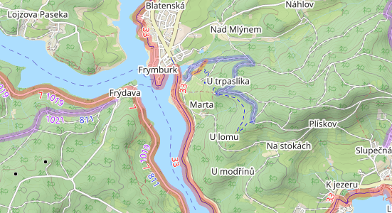
OpenCycleMap balances detail with approachability
What are the main challenges when creating a map?
The main challenge is to make sure the map can be widely understood. I don’t want to create maps that only a few experts can use, or that need end-users to spend a long time pouring over a key to work out what the colours and symbols mean.
The other main challenge is icon design. Trying to create small, clearly understandable icons is hard. Dealing with the situations where there are too many features in one particular spot, and choosing which icons should be prioritised, that’s also hard.
I need to really think about the end users to know which icons are the most important for them.

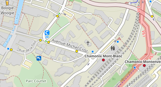
There’s a variety of icons across our maps, each tailored to the purpose of the map
What qualities do you need to be able to create a map?
The software that we use is not very user-friendly, but it’s powerful. So there is a steep learning curve to use it proficiently.
You also need a sense of aesthetics, to be able to choose colours that work well together and that complement each other without clashing.
You definitely need an eye for detail. I spend a lot of time making sure the halos around text are just the right width and opacity, making sure that there’s enough gaps between different icons, and ensuring that paths and roads look just right when they join.
Being able to create a map can be about a lot of small things that people don’t notice. But when it’s not done exactly right, then people do notice that something isn’t right, even if they can’t tell exactly what it is.
How do you know when a map is ready to be used?
I like to make new maps available at a fairly early stage for feedback, so I can iterate.
I also need to see how the maps look in different parts of the world. Often there’s something that doesn’t look right in one city, or I realise a feature is missing. Then I can fix it.
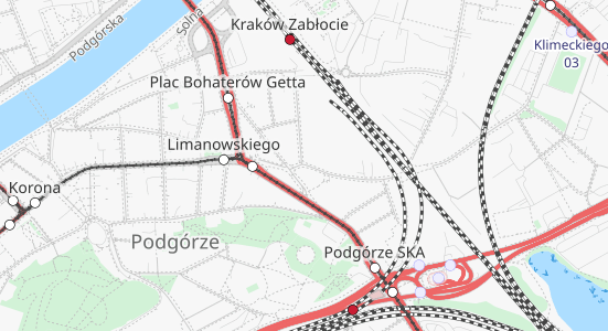
For example, on one map I didn’t realise that roads were being drawn above tram lines, which isn’t an obvious problem in London but was obvious when I looked at Kraków.

Roads, tram lines and train tracks can clearly be seen in Kraków (example from our Transport map)
What’s involved in maintaining a map?
Maintaining a map consists of three different challenges:
- Adapting to changes in OpenStreetMap data: OSM has flexible mapping rules, so from time to time the way that things are mapped changes, and I need to adapt our cartography rules to match.
- Improving the way we show features: If I improve the way we show railways or piers or underground rivers, for example, then I want to add those improvements to all of our different styles.
- Adapting our styles as the technologies we use change. There are usually just small updates when new versions of the software are released, but every few years there’s a big change in technology, and that can be a lot of work to make sure our maps look the same.
Most of our maps see small changes every few months, usually when an improvement to one map is copied across to the others. Major changes to a particular map are much less frequent – and much less frequent than I would like.
What do you enjoy most about creating a map?
I really enjoy that stage where I know a map is going to be useful to someone else. If someone uses our maps to find a cycle route they didn’t know was there before, or they need a drink and they see a cafe shown on our map, then all the effort is worthwhile.